
Mobile Application vs Mobile Website
Gradually, the world has been becoming a
smartphone-centric society. There’s a lot of new mobile devices introduced
every year and even more mobile apps that make day-to-day life easier.
Traditional websites are also affected by this mobile movement. Responsive design is a standard now.
And some of the websites may even go further than responsive design.
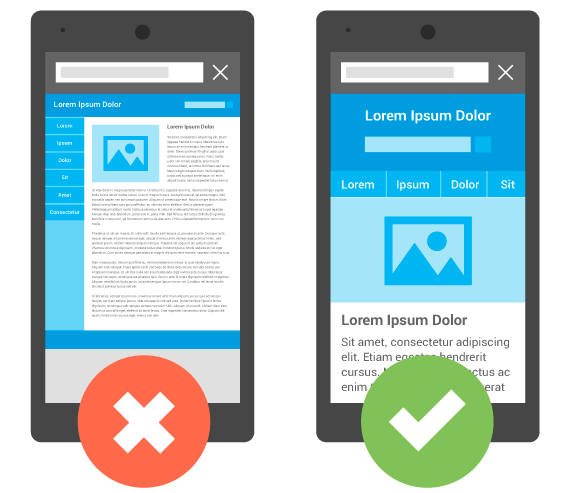
It is the first consideration which will likely come to the mind of people planning the mobile presence of their business. So, what is the main difference between a mobile website and mobile application?
Like any other site, a mobile website includes browser-based HTML pages which are combined together with CSS and Js and accessed over the internet. That is not a novelty.
Mobile apps are actual applications, which are downloaded and installed on your mobile devices. Usually, native mobile applications are built using programming scripts such as Node.js. There are couple of platforms that allows tinkerers to play around with node.js for free. Feel free to take a look. If you’re a newbie, you’ll soon find out that it’s not that simple to make an app compared to a website.
Which is The Better Option?
When it comes to choosing between a mobile
application or a mobile website, the most appropriate choice will depend on
your end goals.
If you want to develop an interactive game, building a mobile application can
be your best option. However, if your goal is to provide mobile-friendly content
to your audience, a mobile site is probably the way to go.
There’s another solution.
You can also use a Progressive Web App (PWA) that keeps modern web capabilities
and is designed for delivering an app-like experience to users. PWA is
described as reliable, fast and engaging. This is a
combination of both worlds – mobile apps and standard websites.
How to Migrate Your Site into a Progressive Web Application (PWA)
Prerequisite for the Migration
- An attached Android device and running Chrome 52.
- You must have a basic understanding of git and Chrome DevTools.
- A text editor with the sample code.
Here are steps to migrate your site into a PWA
1. Loading of the URL
From the command line, duplicate GitHub repository.
It helps in migrating to PWA directory. For this code lab, upload work file and make some changes there. After your code has been checked, use the ‘HTTP server application’ for serving work file on the port 8887. Now you are able to load the URL.
Viewport-The first line has a meta tag that defines the viewport. It will help you with responsiveness. After writing the line of code and reloading your site, you will notice that the website fits your mobile device precisely now.
Manifest- In the next line of your code (2nd line), you have referenced the file. It is a movement that is required to take control over how your website is added to the home screens.
Next, open a text editor and write name section (JSON) which specifies what will be shown on the home screen. It should be within 15 characters only.
Now save your file and reload the page on your mobile device. Go to the top right menu and choose “Add to Home Screen”. You should see your icon on the home screen now.
4. Add a Service Worker
It is a background script which is run by the browser. It runs while the user is not on the page. This element gives offline support and remains active when the notification is pushed.
Create a service worker
Simply copy the below code in a new file and then save it as sw.js.
It helps in migrating to PWA directory. For this code lab, upload work file and make some changes there. After your code has been checked, use the ‘HTTP server application’ for serving work file on the port 8887. Now you are able to load the URL.
2. Check out your site on your mobile
Plug your mobile device with your desktop and type in the URL: “chrome://inspect”. It will allow you to set a port forward with the help of port you had written before to the same port on the device. Press Enter to save it. Now you have access to the basic version of your site at localhost (8887)on the connected mobile phone.
3. Add the Head Tags
Make your site mobile-friendly by adding the Web app manifest. It will help you describe the meta description of your site in a way it will appear on the user’s home screen.
Add the following lines, if you don’t have a templating system in place.
Viewport-The first line has a meta tag that defines the viewport. It will help you with responsiveness. After writing the line of code and reloading your site, you will notice that the website fits your mobile device precisely now.
Manifest- In the next line of your code (2nd line), you have referenced the file. It is a movement that is required to take control over how your website is added to the home screens.
Next, open a text editor and write name section (JSON) which specifies what will be shown on the home screen. It should be within 15 characters only.
Now save your file and reload the page on your mobile device. Go to the top right menu and choose “Add to Home Screen”. You should see your icon on the home screen now.
4. Add a Service Worker
It is a background script which is run by the browser. It runs while the user is not on the page. This element gives offline support and remains active when the notification is pushed.
Create a service worker
Simply copy the below code in a new file and then save it as sw.js.
Service Worker Registration
List this code into your site’s code. For the same, you will have to open your site.js file and paste the following:
navigator.serviceWorker && navigator.serviceWorker.register(‘./sw.js’).then(function(registration) {
console.log(‘Excellent, registered with scope: ‘, registration.scope);
});
Now, this code will get accomplished every time you page loads. To check out, whether or not it is working properly, reload the page.
5. Make Your Site Work Offline
Open the sw.js script and get hold of caches object. Next, update the code and application. Check out how is it working now. Uninstall the current application and load it on Chrome.
Now refresh the page and choose “Add to Home Screen”, available in the right corner menu.
That is all you have to do to turn your website into a progressive web app. It is advisable to take help of a professional in the process. Although these steps are explanatory, there are numbers of elements which can come up as part of the process.


