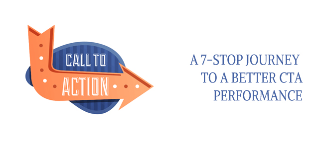
A CTA in as simple words as it can be explained is a Call to Action. It sole reason to be on a webpage is to prompt users to click on it. It can be a piece of text or an image or even any animation. You see them all the time in the form of ad banners and are one of the most important tools of marketing experts and analysts. But how can you maximize the performance of a CTA? Just like you have performance index for academics and sports and you can rate people depending upon their marks, we have similar runs for these CTAs as well and though we don’t have any well defined rules in this field, we still have some ideas that will help you improve the conversion rates of these CTAs. So let’s check them out one by one:
ACTIVE LANGUAGE:
If you’re able to connect with the viewers, there is a very strong chance that they’ll click on your ad. Use engaging texts and keep them as short as possible. Sometimes, even the change of a single word can make the required difference. For example, A/B tests were done on changing text from “Create My Account” and “Create My Account & Get Started” and a reported increase of 31% was seen in the conversion rates. Similarly, “Download” alone might not do the job as efficiently as “Download to save time” might do. So it’s all about provoking them in the right manner.
BENEFITS:
What’s better to ask viewers to click on your ad than to show them the benefits they’ll enjoy! For example, if I want people to sign up for my Guitar classes, I must show them the opportunities that will open up for them in the music industry and well as the importance of the Certificate they’ll get. Similarly, your sign-up form having the fill-up boxes for contact information must also display the features of your website. All the information must be point-to-point and kept short.
KEEP IT CLEAR:
Remember, only ‘good surprises’ are loved by the people. If you can create suspense with your ad and compel people to keep guessing what’s hidden behind, it’s really a very good strategy and works most of the time. It works like a trailer to a complete picture. But just like when a promising trailer ends with a bad movie, people lose trust in you and a bad word of mouth adds up to a very bad image of your website. So it’s better to keep everything simple and clean and even if there are any surprises, they should be kept to the minimum.
SOME ROOM FOR NOTHING:
Any website can be designed in two ways: clustering up everything to make it look more packed and heavier or keeping it spacious with doors and windows to let the air come in. While you can find the first design fitting in many websites, it doesn’t serve any purpose at all. A room filled chocolates doesn’t always get you the candy you’re looking for. However, the spacious option has a class of elegance. People like it when they get some extra space for themselves. Viewers will like to stay for some time to take a look at everything, even if they don’t want it because they like what they see. There’s no suffocation of so many surrounding products and people can actually spend time on products they’re looking for.
THE FOCUS:
A CTA is always meant to be visible to the customer right from the moment he/she lands on that page. There are many different aspects of a CTA and the most important is colour. Green is one of the better choices for this purpose but it depends upon other specifics as well. Also, location of the button on the page, its size, again the text, etc are some of the other numerous factors that will help you shift the focus of any incoming visitor on that button.
SIGNATURE STYLE:
Now that you’ve decided how the CTA will look on one of your page, make it a signature style of yours. Don’t keep changing it from one page to another. There can be some minor changes but the more you add, the harder it will be to find a permanent place into the mind of a viewer. If the same icon or image keeps appearing in front of the eyes of the viewers with the same definition every time, then it becomes easier for them to locate it on a page and it becomes a central point for them.
ALL AT ONE PLACE:
Sometimes it happens that when you visit a super market for suppose, buying a packet of biscuits, you finally end up shopping many more things that you never had on your mind. It happens with everyone and will so with your visitors. So a homepage with all your products lined up on it is a better choice without any idle space. With so many CTAs on one page, the mind of the user obviously gets excited up and you can expect more clicks than usual. But organizing these products in neat and clean structure is very important. Sorting them in different categories is also an option so that the viewer can focus on the main product of his choice and there are more chances for him to buy something similar as well.
SUMMING IT ALL UP:
So here you had some of the ideas that will help you get more out of your CTAs. Remember, these CTAs are always meant to attract the viewers and never interfere in their course of work. But that’s what happens most of the time and it gets the user irritated. So it’s better to leave nothing than a bad impression!
Don’t forget to tell us which ideas were really helpful to you and if you any of your own secret formulae and want to share them with us, we’re all ears!

